In a grand series of works from 2005-2009, which depicted the plants in his garden pond, Jiang Shanqing captured the essence of nature. His majestic depictions of lotuses cover the page and seep into the textured xuan paper. Each leaf is rendered in ink, the intensity of which graduates from pitch black to grey. The individual leaf is carefully delineated to reveal its intricate, botanical structure with its skeleton clearly visible through its fleshy skin. The edges of the plant form serrated borders often highlighted by sprigs of colourful foliage. Jiang's technique is to trail the ink around the paper, sometimes pausing his brush to create puddles of ink in various degrees of density. It is an ink wash technique and approach made famous by Chiang Dai-chen (Zhang Daqian) who, like Jiang, made giant, colour-saturated paintings of the lotuses in his own garden. To paint lotuses has a special resonance in Chinese culture, and the expression Hwa kai fu gui, (as rich and elegant as a blooming flower )refers to the flowering lotus, the properties of which personify the high moral character of the literati.
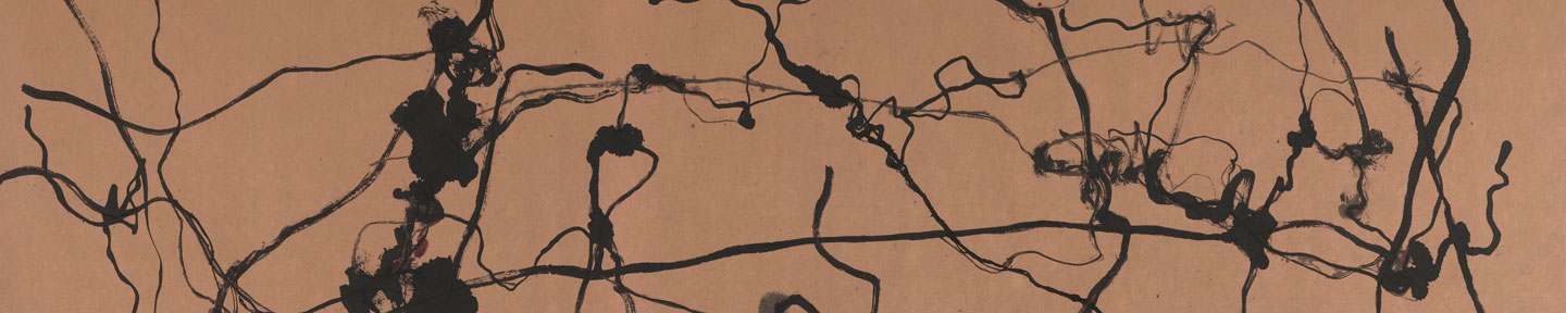
The technique and inspiration that Jiang applies and summons for the pond series, and which becomes wholly abstract by 2009, have informed a new body of work which is illustrated in this catalogue. In one work, the spidery tendrils are now combined with geometric lines. The composition is bound together by a trail of grey/blue ink that rests on top of the design. The positioning of the artist's 'stamp' punctuates the image and draws its centre of gravity to the root or base of the picture (p.15). In another work, a watery residue frames the green tendrils, which end in bloodied foliage (p.19). The geometry is architectural in two other works (155 and 157). In these examples, rigid lines cut across the soft forms and tendrils, illustrating the battle between the rational and intuitive sides of the artist's nature. Jiang has contained his creative impulse as best he might but, and this particularly applies to (p157), the force of his inspiration exceeds the logic of his intellect and seeps over the edges of his geometric wall. The same relationship between reason and instinct are played out in another work (p151). Here Jiang traces a maze-like grid of thick black lines over grey, black and red washes. It is as if his thoughts have been collected and pooled behind a series of rational thought channels.
The space between two brushstrokes is referred to as Zhi kong (the void), and this is ingeniously represented in Jiang's painting (p.19). In this instance the artist manipulates the space on the page between grey and colour tinted lines, leaving a formidable chasm at the heart of the work. The importance of the void is better illustrated in (p20/21) in which five flower stems bi-sect the page at varying intervals. The exercise becomes increasingly complex in works like (p.33) and (p.69)in which the thin tendrils form a loosely constructed grid that divides up the space on the page and then lays on top of the design short, sketchy lines and ink and water puddles. The extraordinary power of (p.69) lies in the clear division of the picture into solid and void. On the left hand side a thick area of black ink highlighted by purple and aquamarine sprouts tendrils into the space beyond. These extended lines and shapes are marked by flashes of ox blood red. It is the palette as much as the design that marks this work out as a masterpiece.
The spirit behind those works primarily concerned with the articulation of space differ markedly from another group of paintings that show another side to the artist's character. The circular work of art (p.2) reflects Jiang's carefree mood. The intricate pattern of receding light grey lines, a tone the artist achieves by using a dry brush, and the black lines that, because of their dense colour, appear to lie on top produce the effect of movement and turmoil. But the design is harmonious and revolves around the artist's seal at the still centre. Another version of this design (p.29) has a darker mood. Here the tendrils and pools of ink coalesce into an almost solid form. But, perhaps no work in the catalogue is denser in colour or heavier in mood than (p.111). In this almost calligraphic rendition of forms the entire surface of the page is smothered in thick black ink. The other 'dark' work in the catalogue (p.141) has expressionist qualities. The great black shape, which forms the central element in the composition rides on its ochre coloured frame. In the painting's four spatial components the artist inserts wild calligraphic marks that appear to have been tossed into the void. This is another great work and Jiang's other masterpiece.
Something else that must be said of Jiang's work is the shi (momentum) that characterises many of the most attractive pieces. Works such as (p.125) and (p.133) have a rhythm and movement that promote a great feeling of well-being in the viewer.
Ink painting has been described as a meditation in which the importance lies not in the form but in spirit that is expressed in each stroke. Zhu Qizhan believed that the ultimate goal of a great artist is to bring out the artistic conception in his work. This can be achieved, he maintained, by expressing the vitality of change and geneses of the universe. Jiang Shanqing has managed to accomplish this in the works illustrated in this catalogue. In every one of these paintings, the artist's sentiment is honestly expressed and imaginatively conveyed. His moods are many and varied, and it is the clear and coherent manner in which he has expressed his changing feelings and applied his intellect that mark these works as amongst the very best of today's brush painting.
Copyright Reserved 2000-2024 雅昌艺术网 版权所有
增值电信业务经营许可证(粤)B2-20030053广播电视制作经营许可证(粤)字第717号企业法人营业执照
 京公网安备 11011302000792号粤ICP备17056390号-4信息网络传播视听节目许可证1909402号互联网域名注册证书中国互联网举报中心
网络文化经营许可证粤网文[2018]3670-1221号网络出版服务许可证(总)网出证(粤)字第021号出版物经营许可证可信网站验证服务证书2012040503023850号